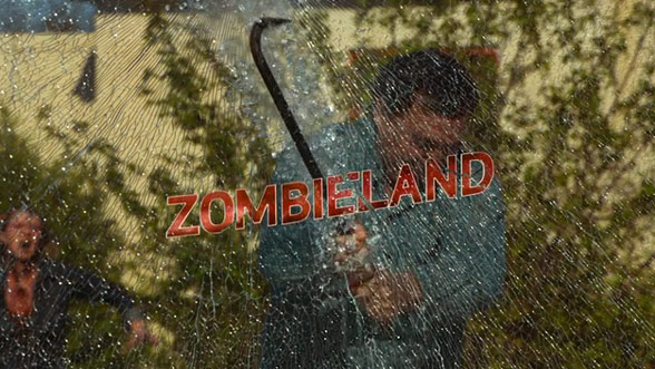
Zombieland
Zombieland uses 'kinetic typography' in the opening sequence, meaning the text itself interacts with things that are occurring in world of the film. The text moves in ways that relate to the text meaning itself by relating its movement and its characteristics to it. During the opening sequence, the text can be seen to be clearly interacting with people and objects, which is an unusual style of typography however I believe it has been effectively used in this opening.The text in the opening sequence is a maroon-red with a white outline, and is in all capital letters which can be seen as representing the gore and blood of the film. The white outline makes the red stand out on any given background and can be interpreted as representing the 'parody' and comedic side of the film (since the film itself is , in fact, a parody).
Panic Room
Panic room uses a similar yet different style of typography to zombieland as it does not use the 'kinetic' style of moving text, however it does link the text to the current scene. The text itself doesn't have any 'flashy' or 'exciting' effects, however it has a reflective nature to it which allows it to suit the title sequence very appropriately as it blends with the buildings and surroundings. The text itself is a dull and boring colour which could show a contrast between the title of the film and the text style. Throughout the title sequence the angles should be noted as they change several times, varying from low shots to high shots and some in between which could be seen as the views of various people from different buildings that are all looking out the window.

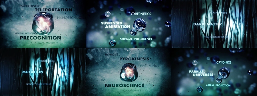
Fringe
Fringe uses a simple yet effective style of typography, when compared to the previous two. The text is bold and simple with no special effects, which conveys a strong sense of seriousness. The text is generally plain colours such as black and white, and each piece of text is in capital letters. Throughout the opening credits strange, scientific and unusual words to reinforce the extraordinary events that take place in the series. Despite the text being very ordinary in style and colour, they can be seen to interact with the objects in the opening scene.

Fringe uses a simple yet effective style of typography, when compared to the previous two. The text is bold and simple with no special effects, which conveys a strong sense of seriousness. The text is generally plain colours such as black and white, and each piece of text is in capital letters. Throughout the opening credits strange, scientific and unusual words to reinforce the extraordinary events that take place in the series. Despite the text being very ordinary in style and colour, they can be seen to interact with the objects in the opening scene.
No comments:
Post a Comment